Everything about SwiftUI is new. And the layout system is no exception. SwiftUI no longer uses Auto Layout, gone all of the cruft introduced over the years. SwiftUI has a completely new layout system designed from the ground up to make it easy to write adaptive cross-platform apps.
I have always been fascinated by the layout systems. I built an open-source UIStackView replacement, designed a convenience API on top of Auto Layout (granted, many people did). I also have experience working with the layout systems on the web, including Flexbox. I can’t be more excited to dig deep into the SwiftUI layout system to see what it has to offer.
Layout Basics #
Let’s start with the most basic “Hello World” example.
import SwiftUI

struct ContentView: View {
    var body: some View {
        Text("Hello World")
    }
}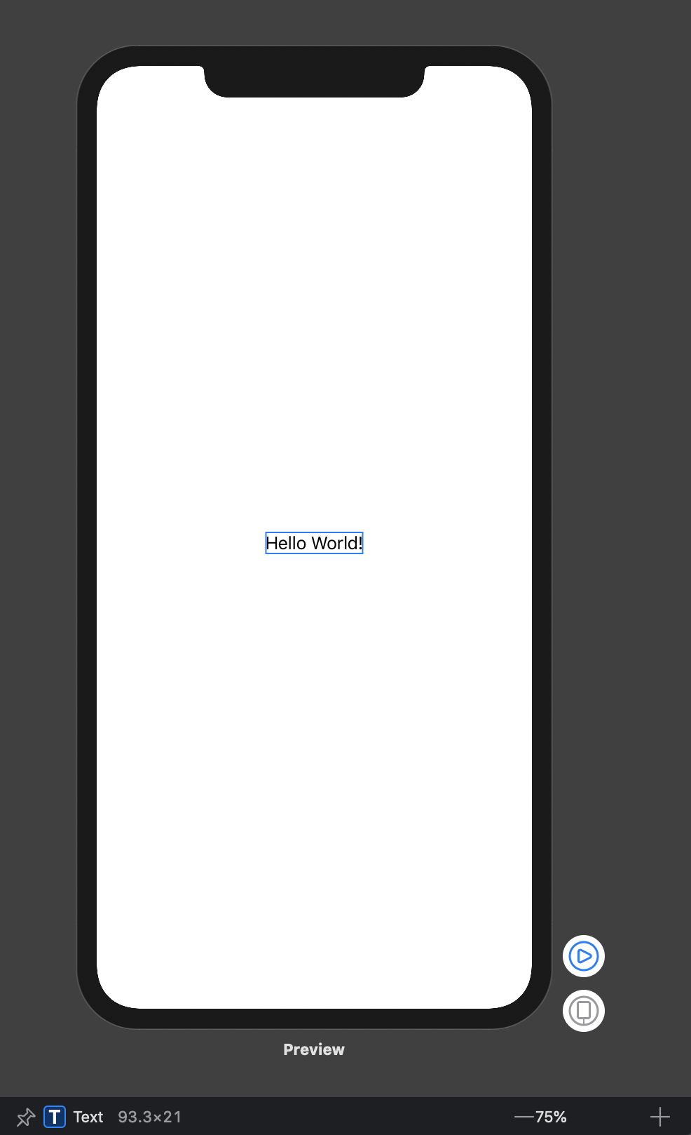
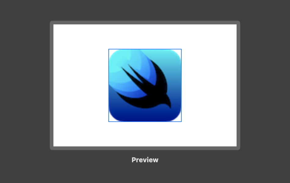
The moment you open the preview, you are already experiencing the layout system. The blue box in the preview editor indicates the bounds of the ContentView on screen. The bounds of the view are the same as its body, the text, which is at the bottom of the view hierarchy1. And finally, the root view which in this case has the dimensions of the device minus the safe area insets.
Safe Area
Safe area helps you place your views within the visible portion of the overall interface. In the example, the safe area of an interface excludes the status bar area. In SwiftUI, you are in the safety zone by default. You can still lay views out outside the safe area using the following modifier:
Text("Hello World")
    .edgesIgnoringSafeArea(.all)
The top layer of any custom view, like ContentView, is layout neutral. Its bounds are defined by the bounds of its body, in this case, Text. For the purposes of layout, you can treat the custom ContentView and Text as the same view. Now how did SwiftUI establish the bounds of the ContentView and why did it it position it in the center of the root view? To understand this, we need to understand how SwiftUI layout system works.
Layout Process #
There are three steps in SwiftUI layout process.
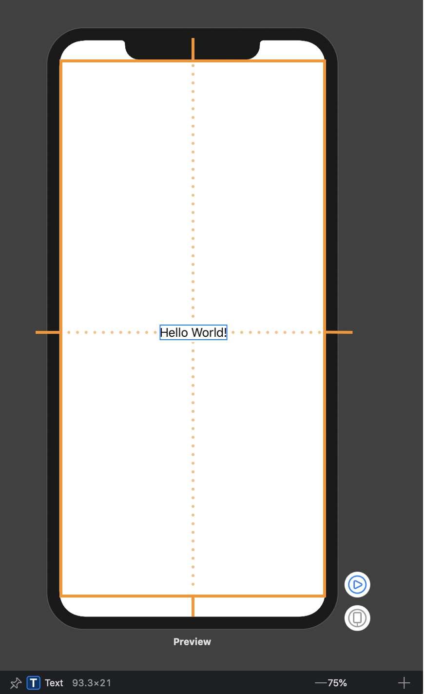
1. Parent Proposes Size for Child
First, the root view offers the text a proposed size – in this case, the entire safe area of the screen, represented by an orange rectangle.
2. Child Chooses its Size
Text only requires that much size to draw its content. The parent has to respect the child's choice. It doesn't stretch or compress the child.
3. Parent Places Child in Parent’s Coordinate Space
And now the root view has to put the child somewhere, so it puts in right in the middle.
This is it. This is a simple model, but every layout in SwiftUI is calculated this way. This is a major departure from Auto Layout in many important ways.
First, it is in some ways closer to simple frame-based layout where the child had no affect on the parent’s frame. This wasn’t the case with Auto Layout where constraints work in both directions: in some cases, a parent would determine the size of a child, but sometimes it was the other way around. This was a major source of complexity in Auto Layout and it is gone now.
Second, as you might have noticed, we haven’t explicitly said anything about the layout, but there were no “Ambiguous Layout” warnings. Unlike Auto Layout, SwiftUI always produces a valid layout. There is no such thing as an ambiguous or an unsatisfiable layout2. The system does its best to always produce the best result and give you the control when needed.
Antialiasing
One other thing that was also mentioned on WWDC is that at the final step, SwiftUI automatically rounds the edges of your views to the nearest pixels. This is important to note, but, as far as I know, it is no different from Auto Layout.
Now that we’ve looked at the most basic example and have an idea of how SwiftUI layout process works, let’s see what instruments does it offer. In Auto Layout, all the APIs were built on top of the same technology - constraints. This isn’t the case with SwiftUI in which everything: Stacks, Frames, Paddings, etc – is its own thing. To understand the layout system means understanding all of these instruments. Let’s start with the most basic one - frames.
Frame #
First, forget everything you know about frames in UIKit or AppKit. Those have nothing to do with frame(width:height:alignment:) and other related methods in SwiftUI.
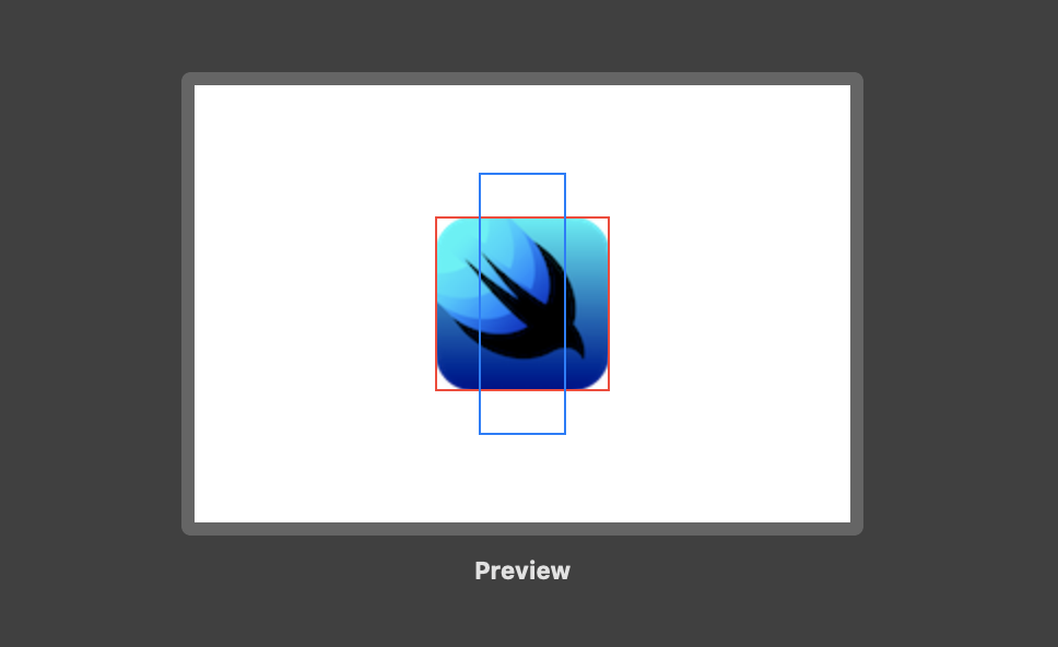
Let’s take a 60x60 image and display it using SwiftUI’s Image. Look what happens if I set the frame to 80x80.
struct Frame: View {
    var body: some View {
        Image("swiftui")
            .border(Color.red)
            .frame(width: 80, height: 80)
            .border(Color.blue)
    }
}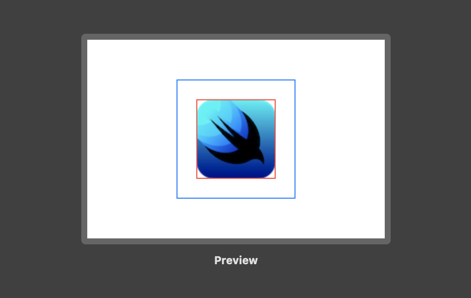
The image has not changed its size. Why is that? A frame in SwiftUI is not a constraint. Neither it is the current frame or bounds of the view. Frame in SwiftUI is just another view which you can think of like a picture frame.
By calling Image("swiftui").frame(width: 80, height: 80), SwiftUI creates a new invisible container view with the specified size and positions the image view inside it. The layout process then performs the same steps as we just described previously. The new container view proposes its child, Image, the size 80x80. Image view responds that it is only this big – 60x60, but thank you anyway. The Frame needs to put the image somewhere, so it puts the image in the center – it uses .center alignment by default.
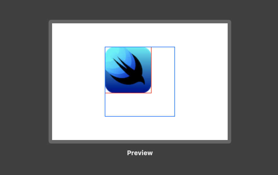
The alignment parameter specifies this view’s alignment within the frame. The default one is .center, but you can select any of the other available ones:
struct Frame: View {
    var body: some View {
        Image("swiftui")
            .border(Color.red)
            .frame(width: 80, height: 80,
                   alignment: .topLeading)
            .border(Color.blue)
    }
}
In SwiftUI, unless you mark an image as resizable, either in the asset catalog or in code, it’s fixed sized. If marked resizable, frame now directly affects the size of the image view:
struct Frame: View {
    var body: some View {
        Image("swiftui")
            .resizable()
            .border(Color.red)
            .frame(width: 80, height: 80)
            .border(Color.blue)
    }
}
All of the parameters of the frame(width:height:alignment:) method are optional. If you only specify one of the dimensions, the resulting view assumes this view’s sizing behavior in the other dimension.
Finally, let’s see what happens when the frame is smaller than the size of the content.
struct Frame: View {
    var body: some View {
        Image("swiftui")
            .border(Color.red)
            .frame(width: 40, height: 80)
            .border(Color.blue)
    }
}
Like any other view, the child ultimately chooses its own size. It is important to understand this property of the SwiftUI layout system.
We used alignment to position the child inside the frame. Other instruments can be used to position the child in its parent’s coordinate space, like position(x:y:) and offset(x:y:). And frame(width:height:alignment:) is not the only way to specify a frame for the view. There is another variation that allows you to specify minimum, maximum and ideal width and/or height which I not cover in this post.
Stacks #
When creating a SwiftUI view, you describe its content in the view’s body property. However, the body property only returns a single view. You can combine3 and embed multiple views in stacks4.
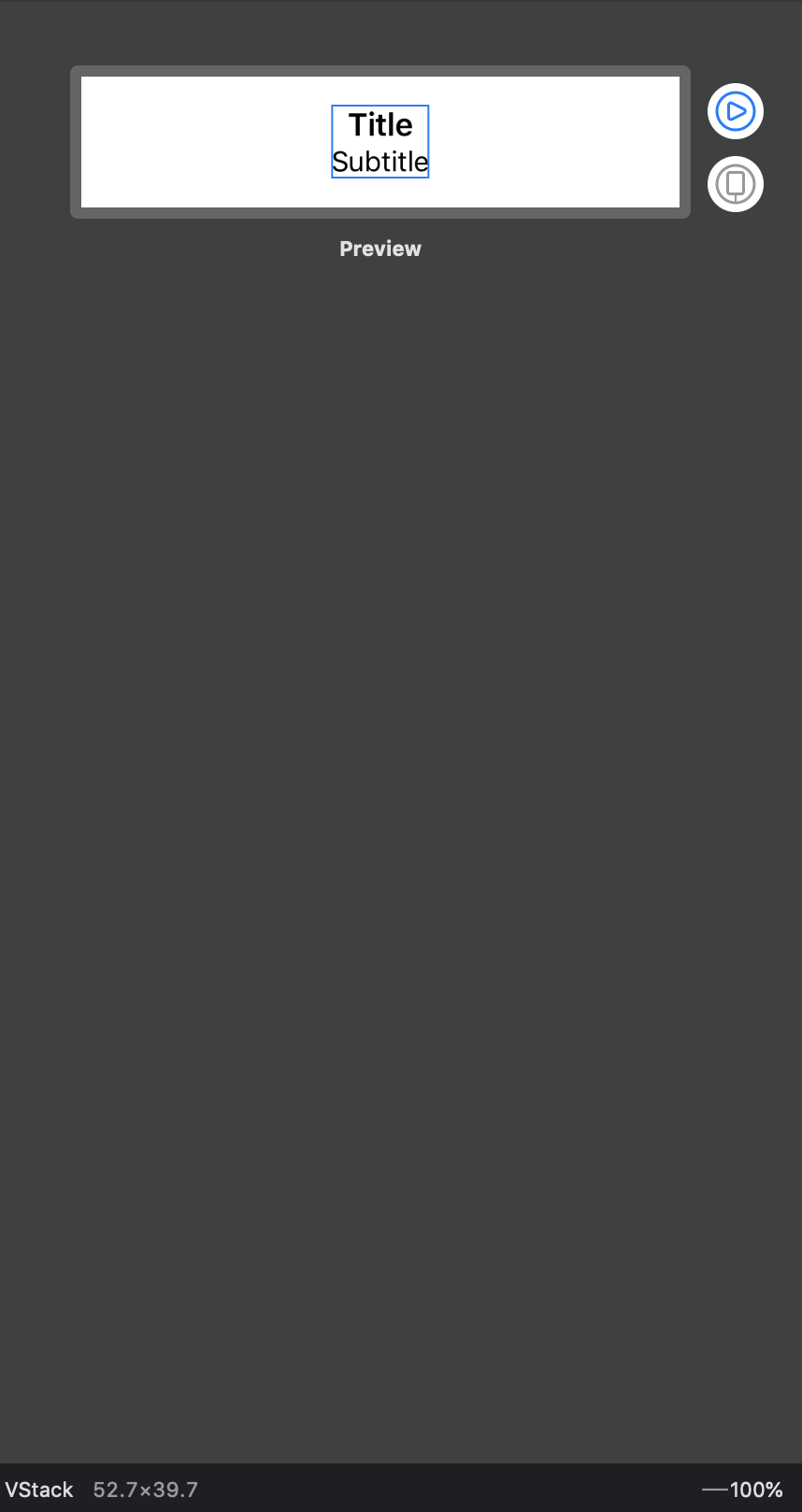
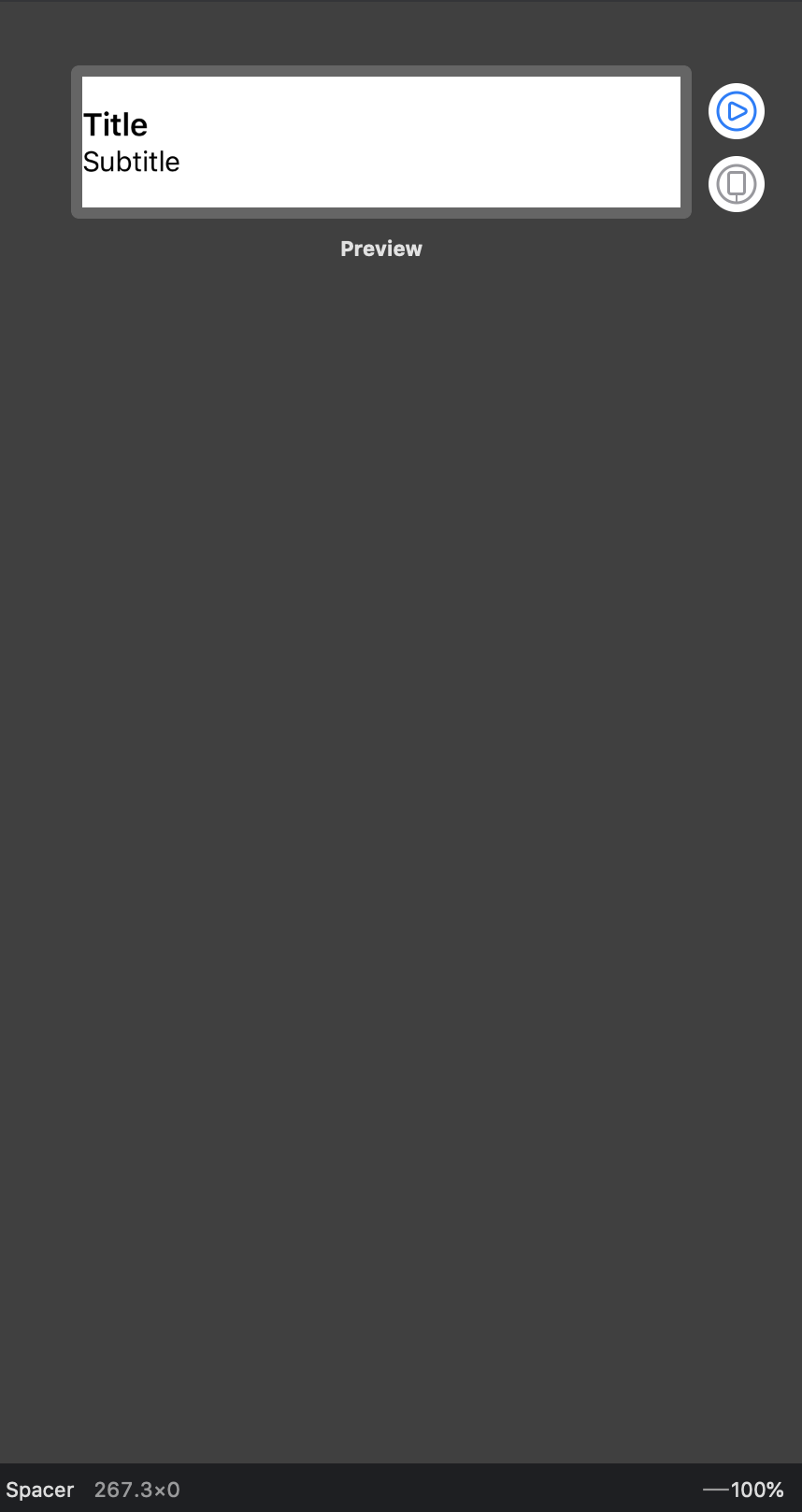
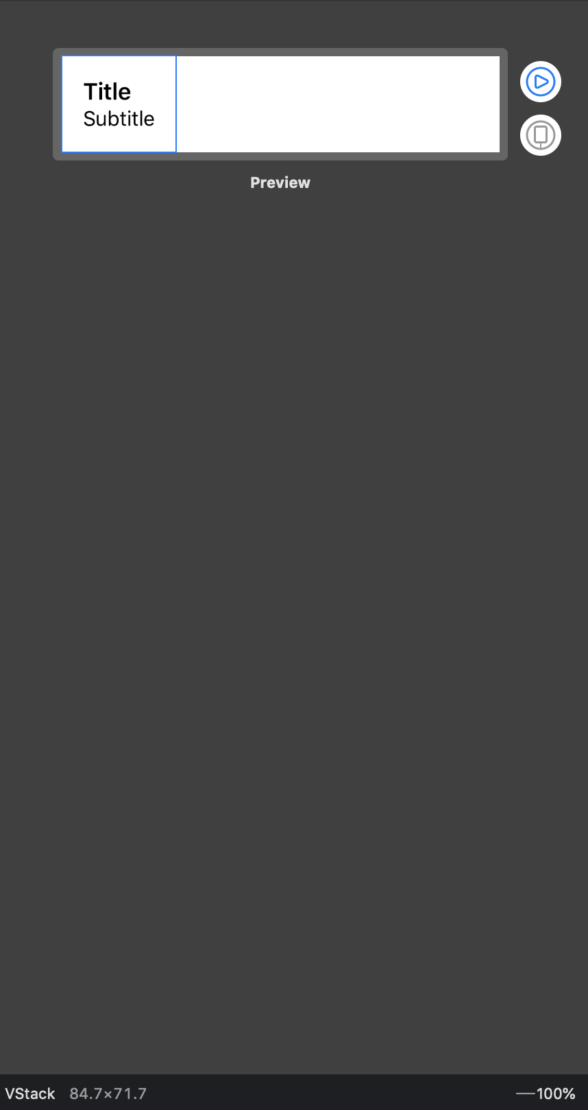
Text views to VStack.
struct ContentView: View {
    var body: some View {
        VStack() {
            Text("Title")
                .font(.headline)
            Text("Subtitle")
                .font(.subheadline)
        }
    }
}

struct ContentView_Previews: PreviewProvider {
    static var previews: some View {
        ContentView().previewLayout(
            .fixed(width: 320, height: 70)
        )
    }
}.center alignment. That's not quite what we want.
Stacks are the primary layout instrument in SwiftUI. The vast majority of layouts can be implemented using stacks. Stacks might seem almost too simple, and they are5. But don’t underestimate them. You are going to use stacks a lot in SwiftUI. Understanding how they work is probably more important than anything.
Stack Layout Process #
There are three simple steps in the stack layout process.
Step 1. The stack figures out the internal spacing and subtracts it from the size proposed by its parent view.
Step 2. The stack divides the remaining space into equal parts for each of the remaining views. It then proposes one of those as the size for the least flexible child. Whatever size it claimed, it deducts that from the unallocated space. And then it repeats.
Step 3. All children have sizes. The stack lines them up with the spacing and aligns them according to the specified alignment. By default, the alignment is – you guessed it –
.center. Finally, the stack chooses its own size so that it exactly encloses the children.
The first and the last steps probably don’t require any explanation. Step two, on the other hand, might be hard to wrap your head around. I think the best way to understand it is by going through a few examples.
Let’s start with a simple example with two image views. The size of each image is 80x80 points, which is non-negotiable (use resizable to allow an image to resize). Regardless of what size the stack proposes to any of the images on step two, the image always returns 80x80. The size of the stack itself, with spacing 10, is always going to be 170x80, regardless of the size of its parent.
struct ContentView: View {
    var body: some View {
        HStack(spacing: 10) {
            Image("swiftui")
            Image("swiftui")

        }
    }
}

struct Frame_Previews: PreviewProvider {
    static var previews: some View {
        // Top: 200 x 140
        // Bottom: 140 x 140
    }
}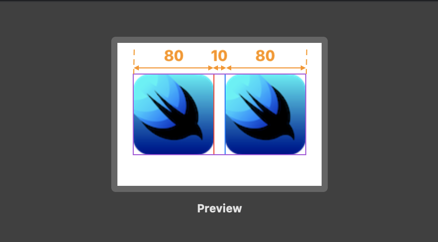
This first example again shows that in SwiftUI the child ultimately chooses its size. In that regard, SwiftUI layout feels much lighter and more manageable than Auto Layout. There are no layout errors, the stack doesn’t arbitrarily resize any of the images. SwiftUI always produces a well-defined result.
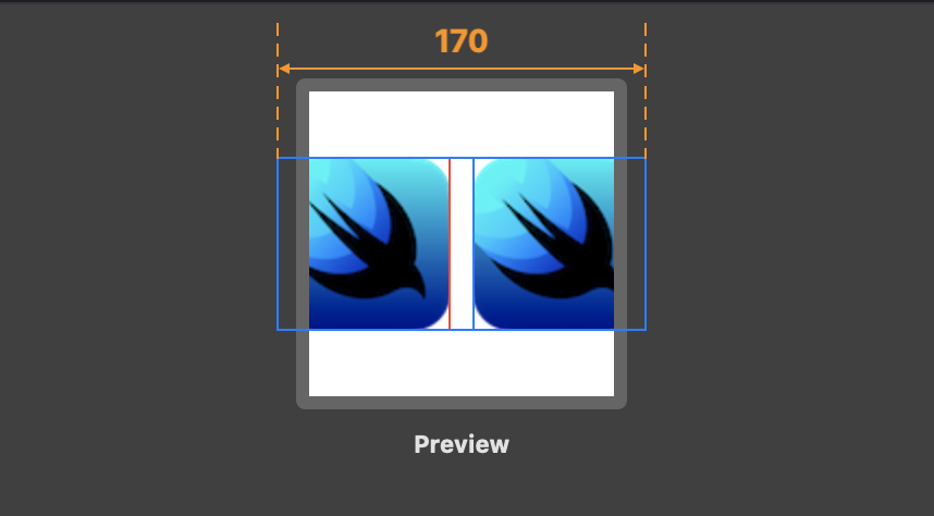
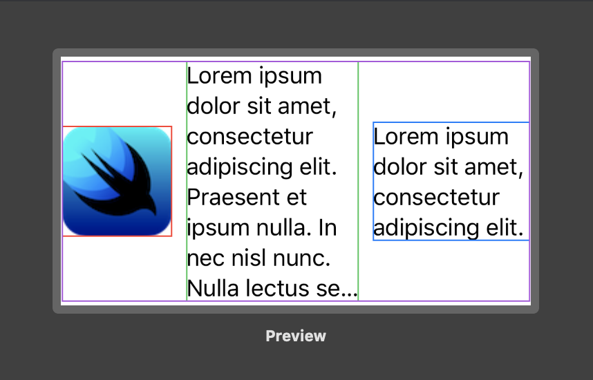
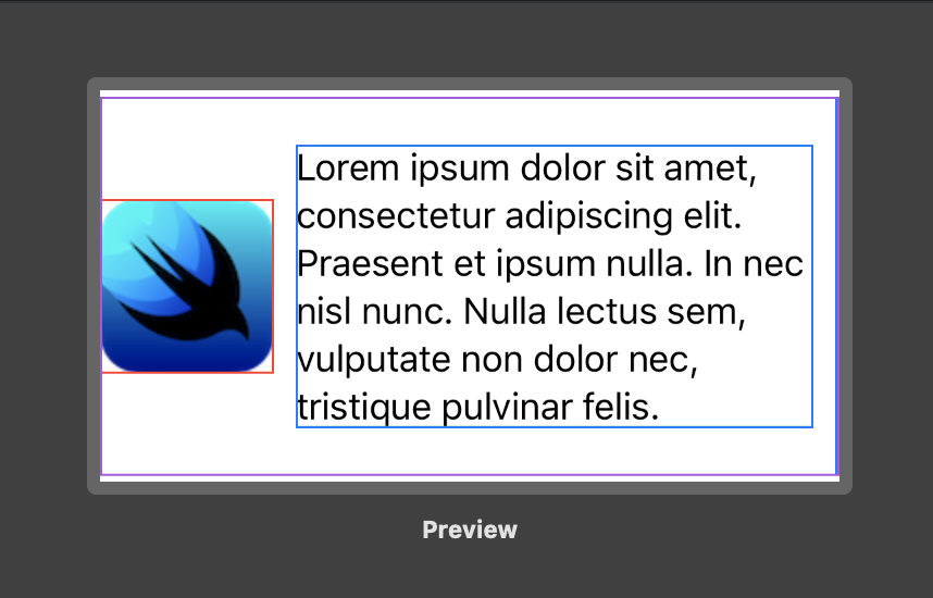
Let’s now look at another example. This time, let’s throw some more flexible views into the mix - Text views. The scenario where everything fits is not particularly interesting. The question is what happens if it doesn’t?
struct ContentView: View {
    var body: some View {
        HStack(spacing: 10) {
            Image("swiftui")
                .border(Color.red)
            Text("Lorem ipsum dolor sit amet, consectetur adipiscing elit. Praesent et ipsum nulla. In nec nisl nunc. Nulla lectus sem, vulputate non dolor nec, tristique pulvinar felis.")
                .border(Color.green)
            Text("Lorem ipsum dolor sit amet, consectetur adipiscing elit.")
                .border(Color.blue)
        }
    }
}

struct Frame_Previews: PreviewProvider {
    static var previews: some View {
        // Top: 230x120
        // Bottom: 340x180
    }
}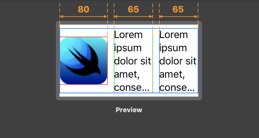
In the first example (top screenshot) the width of the preview is 230. The spacing is 10, so the initial unallocated space is 210 (230 - 10 * 2). So, now the stack needs to calculate the size of its children.
- The stack splits the space into three equal parts, each of the width 70.
- It then proposes this size to the least flexible child. In our case, it’s
Image. Its size is 80x80. So that view is out of the picture. The order is irrelevant. If you move the image to another position, the layout stays the same. - The stack subtracts the width of the image from the remaining space, so the remaining space is 130 (210 - 80).
- The stack again splits the space into two equal parts, each of the width 65.
- It proposes the size 65x120 to the first text view. The text responds that, yeah, the content won’t fit, but it can manage to display at least a portion of it. The same happens with the second text view. So even though the text views had a different amount of text, they both got the same width.
In the second example (bottom) we give the stack a little bit more space. So the second text now fits. But because the stack always splits the unallocated space into equal parts, the second text view occupied almost all of the available space.
Layout Priority
You can raise the layout priority of views in a stack from the default of zero. A stack offers the children with the highest priority all the space offered to it minus the space required for all its lower-priority children.
Environment #
Ok, so frames and stacks are great. But what makes SwiftUI also stand out in terms of supporting adaptive cross-platform apps is the environment.
When you add padding to a view, SwiftUI automatically chooses an amount of padding that’s appropriate to the platform, dynamic type size, and environment. SwiftUI also automatically sets appropriate spacings between the views in a stack. SwiftUI updates a safe area according to the device. You get the idea.
When you don’t pass any parameters, you get adaptive behavior in the same way that SwiftUI adaptively styles a picker or a button depending on the context it’s in. And if you to customize any of these parameters, you can do that too.
SwiftUI also makes it easy to react to the changes to the environment. Every view in SwiftUI gets access to the system environment settings like content size category, device size classes, layout direction, and more. So, for example, if you want to set custom spacings for each size category, you can do that easily with SwiftUI.
By using @Environment property wrapper, you can read the environment values and subscribe to their changes. Technically, the environment is not part of the layout system, but I think it was worth mentioning it.
struct ContentView: View {
    @Environment(\.sizeCategory) var sizeCategory

    var body: some View {
        // This is just an example.
        HStack(spacing: sizeCategory == .large ? 20 : 10) {
            Image("swiftui")
            Text("Lorem ipsum dolor sit amet, consectetur adipiscing elit.")
        }
    }
}
Final Thoughts #
This article is largely based on the fantastic Building Custom Views with SwiftUI WWDC 2019 session. I would highly recommend watching it.
With Auto Layout, Apple took a solution – a layout engine Cassowary, and tried to make it fit the problem – building adaptive user interfaces. It was powerful, but it was lacking in many important areas. It had performance issues, it was complex, debugging it was hard. Apple tried to make it better by introducing more and more Auto Layout APIs over the years: anchors, stack view, safe area. But they never fixed the core problems with the technology.
In Auto Layout one rogue constraint could lead to completely unpredictable results far from the view where it was defined. SwiftUI, on the other hand, is simple and predictable. It should be always possible to understand at a glance why the layout system produces certain results.
You can feel that SwiftUI was created with a completely different mindset than Auto Layout. It is not an academic exercise to efficiently solve systems of linear equalities and inequalities. It is a pragmatic tool designed to solve the real problems that app developers face when creating adaptive cross-platform apps for Apple platforms. And it solves them in a beautiful way by providing a set of small and simple tools which are easy to combine – the Unix way6.
Swift dominance didn’t come from the server, it just might from the UI.
References
- WWDC 2019, Building Custom Views with SwiftUI
- Apple, SwiftUI Tutorials
-
Unfortunately, there is no way to examine the view hierarchy in Xcode Previews yet. I hope this is something that will be added in the future. For now, Apple recommends you add borders to the views for debugging purposes. ↩
-
The Debugging Auto Layout section of the Auto Layout guide is probably longer than the rest of the guide. This says something about the system. I bet everyone had their share of moments where solving an Auto Layout problem turned out to be a blind alley. ↩
-
There are not a lot of options for combining multiple views in SwiftUI. You can no longer call
addSubview(_:)and then layout the contents any way you want – you must use one of the existing container views. And, as far as I can tell, there is currently no way to create custom containers in SwiftUI. ↩ -
It feels that when you talk about stacks, you must mention Flexbox. This is a technology that supposedly inspired
UIStackViewand stacks in SwiftUI. I don’t know if it’s true, but Flexbox is indeed a similar tool. The previews that you see in this post are powered by Flexbox. Flexbox is somewhat more powerful than stacks in SwiftUI with support for overflow, etc. However, I find Flexbox to be much more cumbersome to use that stacks in SwiftUI. ↩ -
Stacks in SwiftUI are extremely simple, especially compared to
UIStackViewwhich has a lot of options, some of which I doubt anyone even uses. One of the examples is.fillProprtionallydistribution. I’ve personally never used it. I did partially implement it when building aUIStackViewreplacement. One of the limitations was the fact thatUIStackViewuses a neat private method_intrinsicContentSizeinvalidatedForChildViewto monitor when one of its children updates its intrinsic content size. How Apple decided that this distribution needed to be built in the first is unclear. ↩ -
This Is The Way. ↩